Full cycle creative advertising agency

digital transformation / video / creative / design

fkn burger
The largest full cycle advertising production beyond the Urals
Its visitors can taste authentic traditional American burgers.
burger-packed
FKNB stands for Friends know the name Burger. In these four words, the basic principle of the brand is laid down — this is a place for friends, for whom everything the most delicious, satisfying and appetizing is prepared. As if there are no casual visitors here. And only those who know a lot about real burgers and strong friendships.
burger-menu
fkn burger
In the process of creating a brand, a team of specialists from the Kruche! decided to move away from templates and rethink the concept of a burger. This establishment should not be associated with regular fast food with accompanying junk food of questionable quality. In our case, burgers are a tasty and nutritious dish for a young and innovative audience with a taste for food.
ketchup
This burger shop was created for modern and active people 20–35 years old, who are tired of rubber creaking not only on cars, but also in burger cutlets in the frantic rhythm of the city. These are consumers who want to relax and taste juicy, huge burgers prepared according to the proprietary recipe.
ketchup
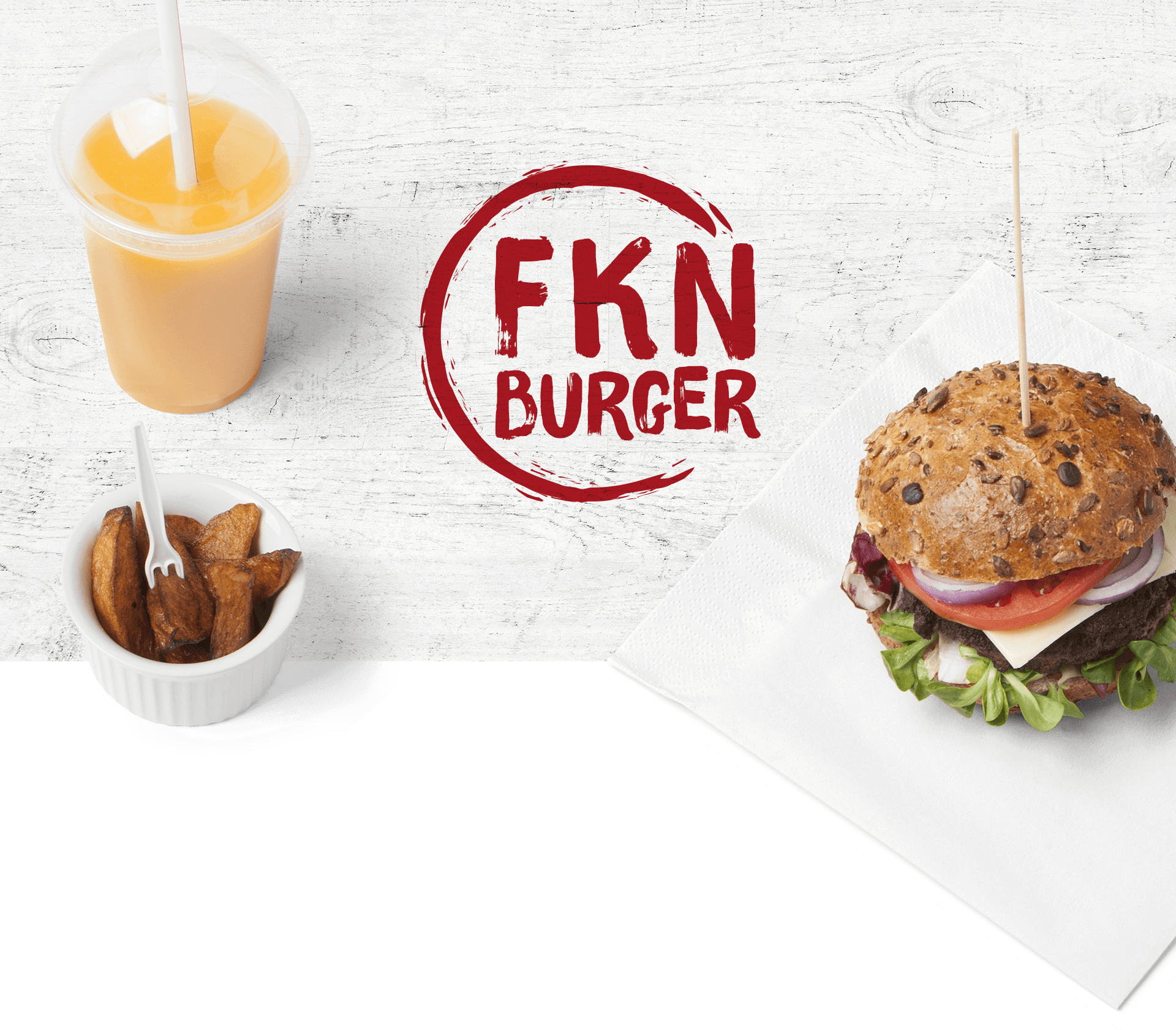
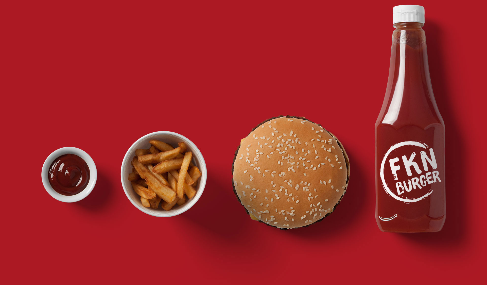
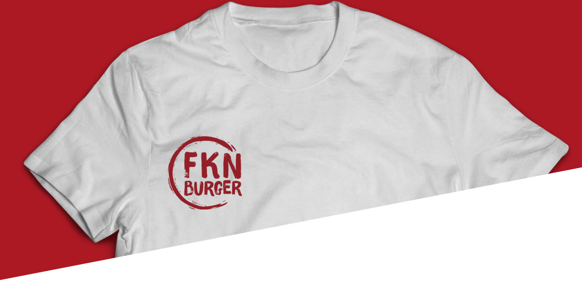
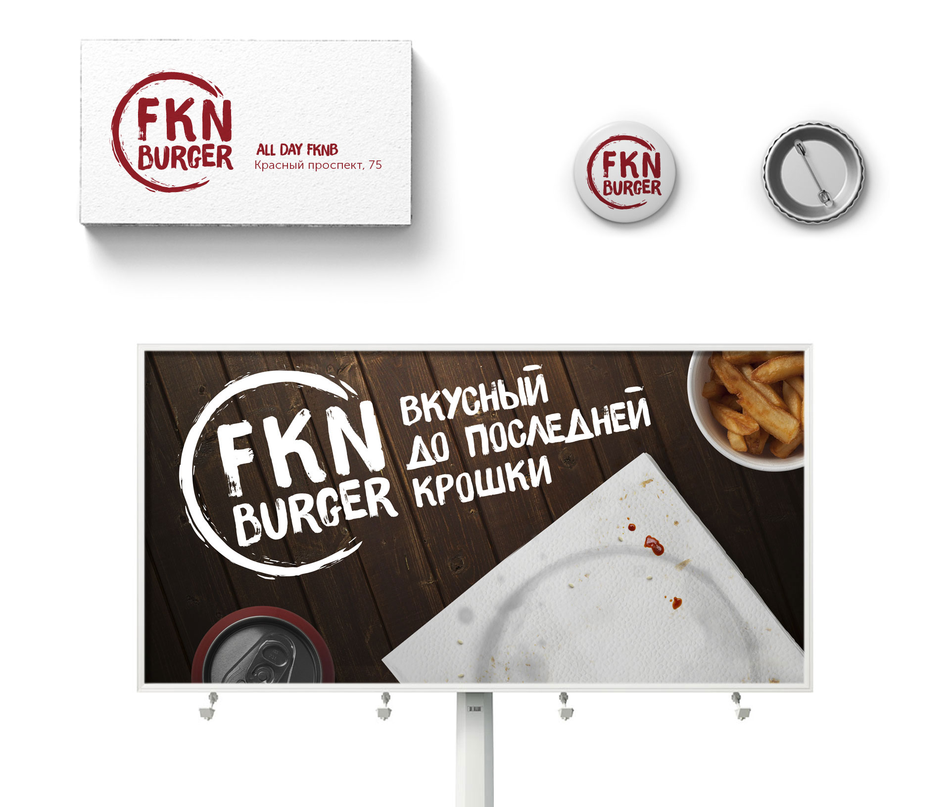
When developing the corporate identity for the friendly burger, the agency focused on simplicity of details and colors. This is how the concept of a logo depicting only a burger’s imprint appeared, which speaks, firstly, of the ease of brand communication, and secondly, that the company’s product is so tasty that not even a crumb is left of it.
fkn burger
The whole complex of ideas found its expression in the positioning of the institution as warm and friendly, at the same time with a rebellious identity, with hand-made graphics and the texture of natural materials in the design. This style will be developed in all brand attributes: from business cards to staff uniforms and real graffiti in the interior.