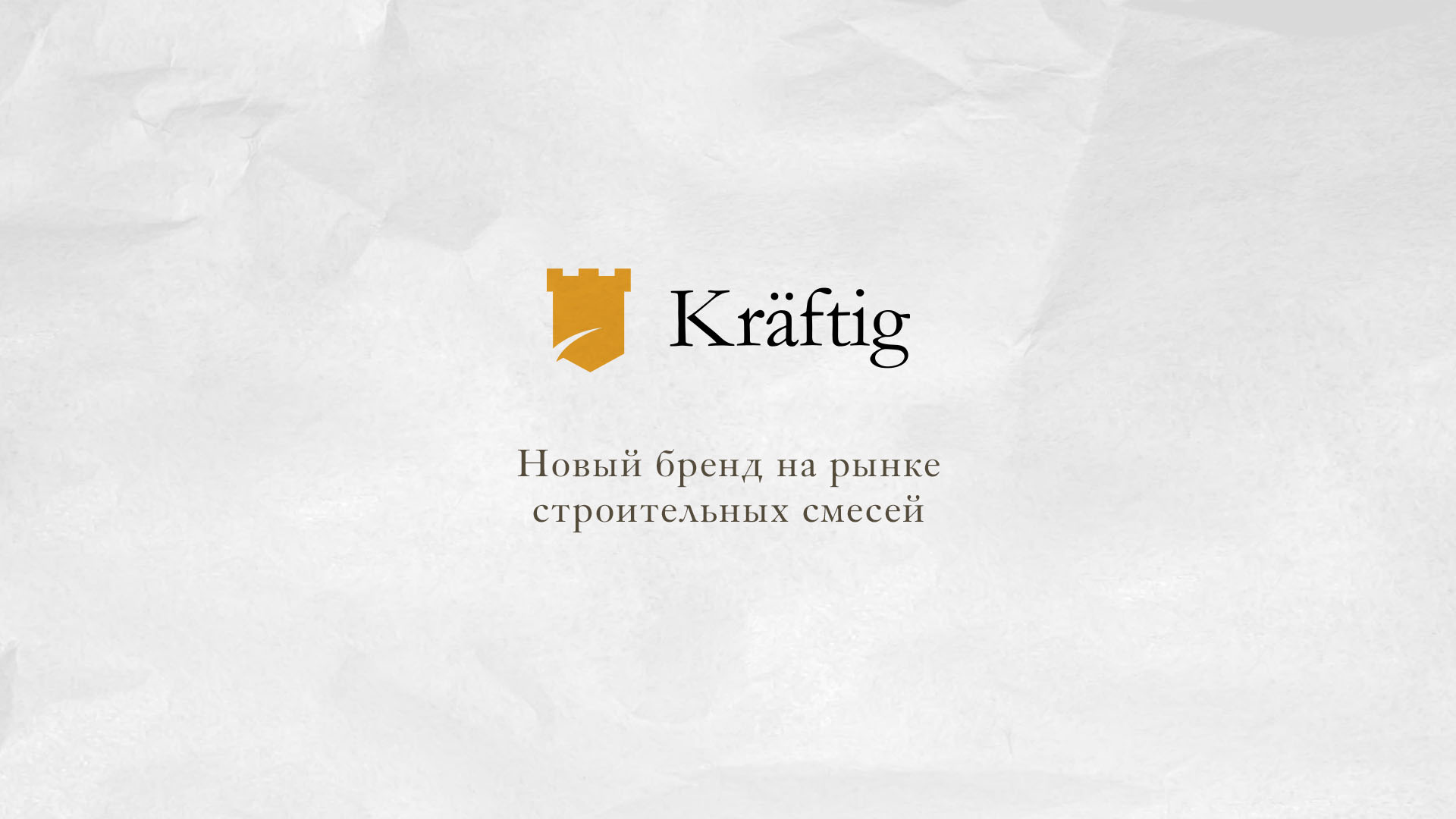
Naming and packaging Kraftig
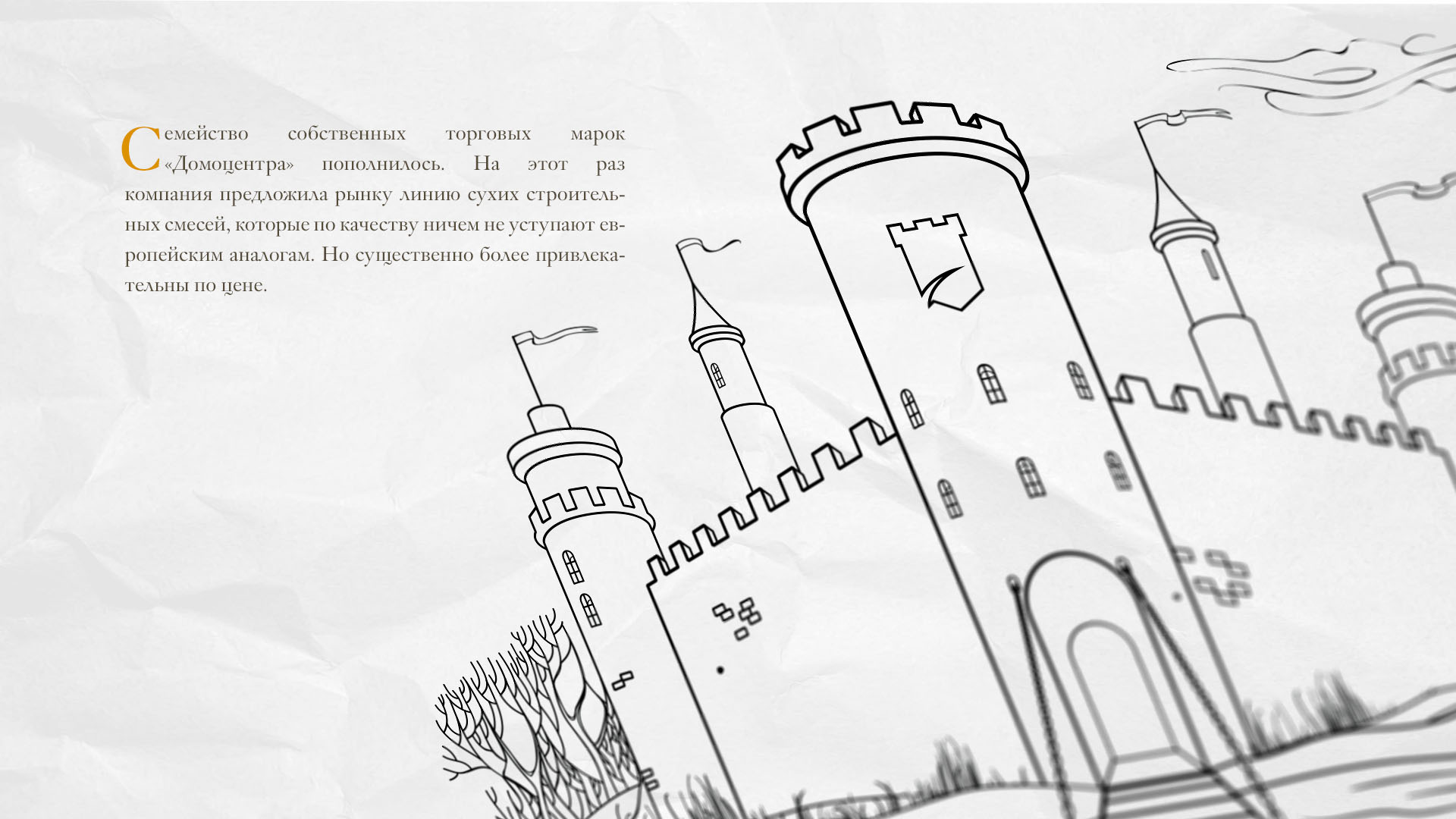
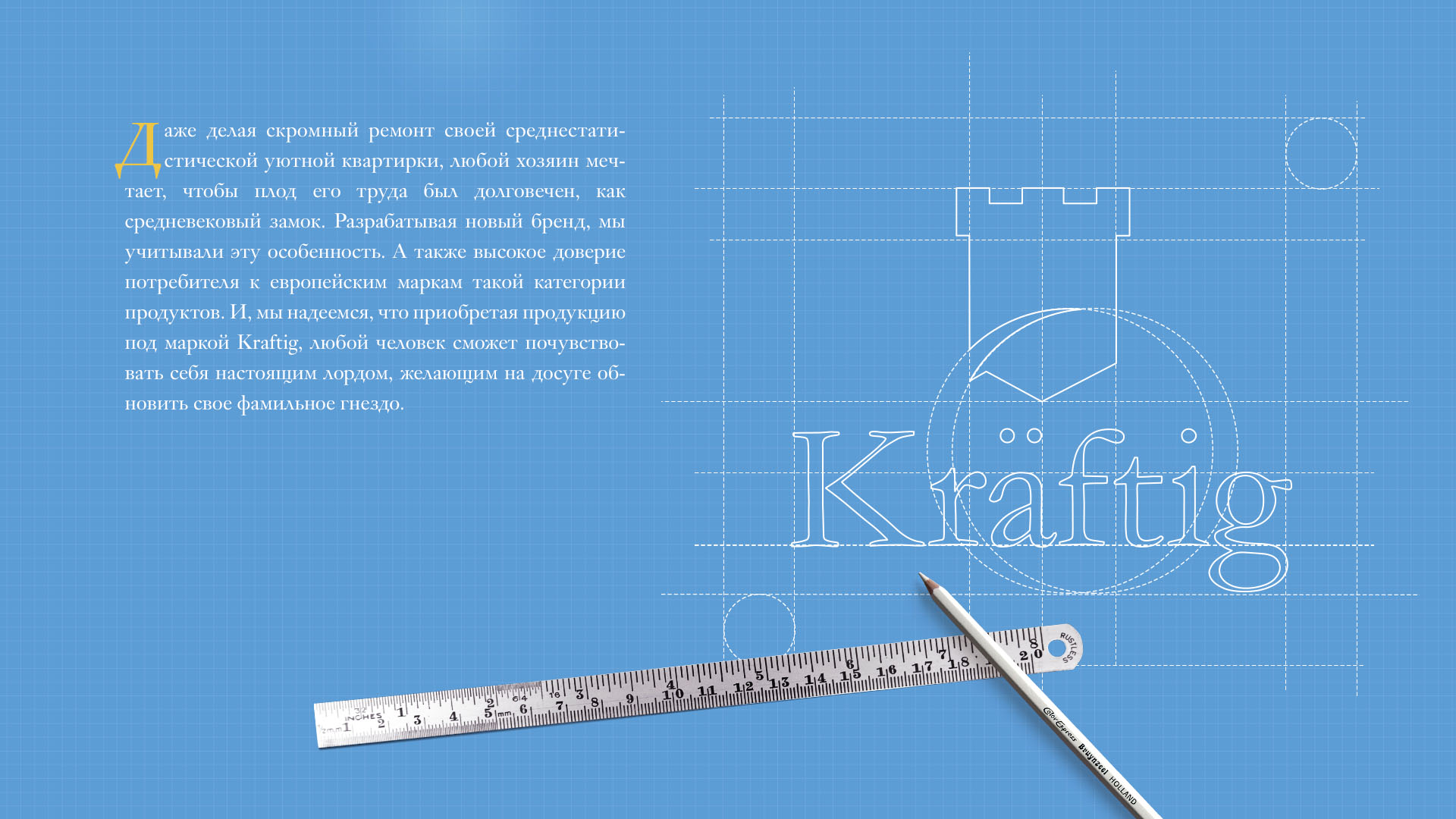
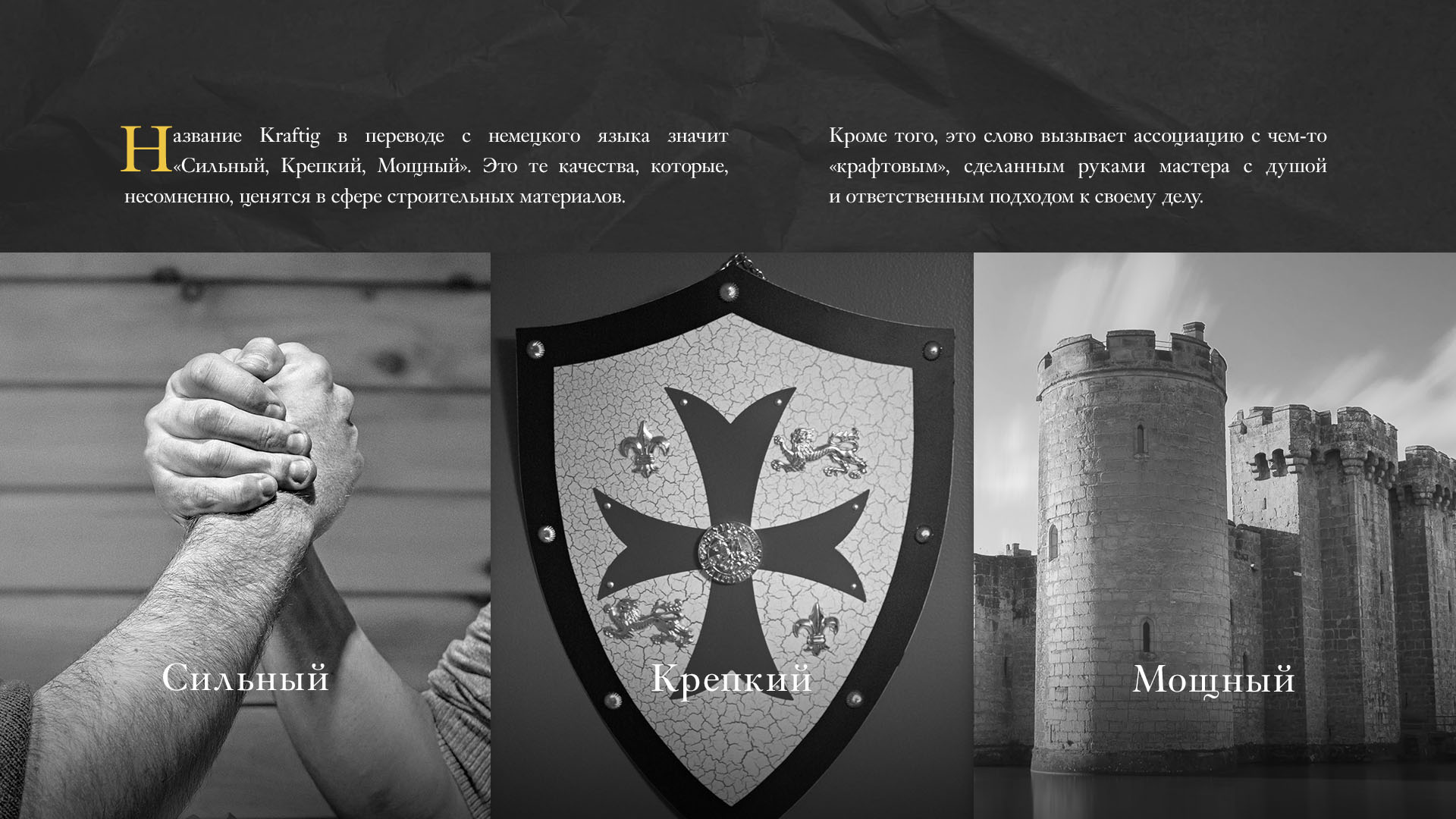
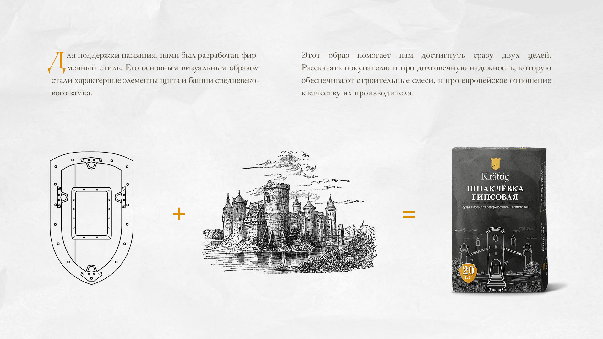
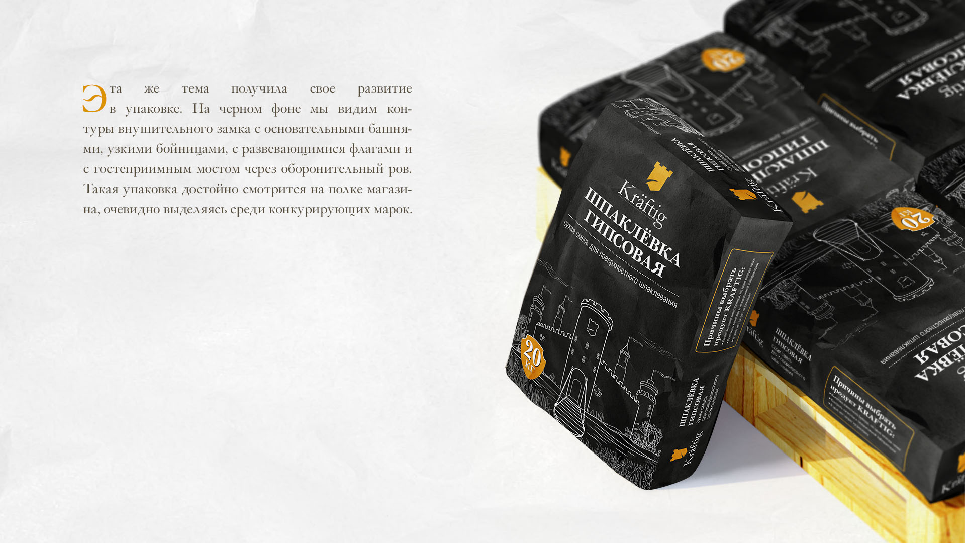
Even making a modest renovation of his average cozy apartment, any owner dreams that the fruit of his labor would be as durable as a medieval castle. When developing a new brand, we took this feature into account. And also high consumer confidence in European brands of this category of products. The name Kräftig translated from German means “strong, strong, powerful”. These are qualities that are undoubtedly appreciated in the building materials industry. In addition, this word evokes an association with something "craft" made by the hands of a master with a soul and a responsible approach to his work. To support the name, we have developed a corporate identity. Its main visual image is the characteristic elements of the shield and tower of a medieval castle. This image helps us achieve two goals at once. To tell the buyer about the long-term reliability provided by building mixtures and about the European attitude to the quality of their manufacturer. The same theme was developed in packaging. Against a black background we see the outline of an imposing castle with solid towers, narrow loopholes, waving flags and a hospitable bridge over a defensive moat. Such packaging looks decent on a store shelf, obviously standing out from competing brands. And we hope that by purchasing products under the Kräftig brand, anyone will be able to feel like a real lord who wants to renew their family nest at their leisure.
Category: Branding
Like
Similar projects
MacCoffee Dolce Vita
Branding
1

Trapeza "Around the World"
Branding

KOREA MOTORS branding
Branding

Kusai.me - branding
Branding
1

Naming, identity, packaging Hometag
Branding

kruchenas.net for the funniest milkman in the country
Branding

Water from the very heart of Siberia
Branding

Kruche! for AquaLand
Branding

kruchenas.net designed a logo for the training club
Branding
Krym cherez "Y"
Branding

Packaging design "Trapeza Na Vtoroye"
Branding

Delicious naming from kruchenas.net
Branding

Private label redesign Family Life
Branding

POS materials design for Amway
Branding

Grün branding
Branding
1

Forma branding
Branding

Naming and packaging Kraftig
Branding

Naming and identity "From My Hart"
Branding

Redesign of premium spices "Around the world"
Branding

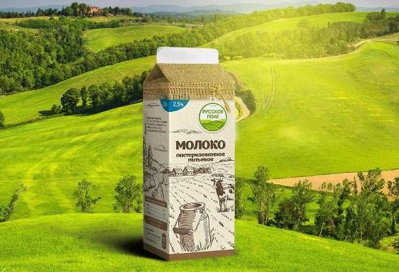
Russkoe Pole - branding
Branding
2
3D modeling of packaging
Branding

Dried apricots Sofa. Menu design
Branding
Felitta pasta
Branding

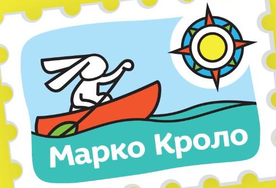
Naming and identity of Marco Crolo
Branding
«Trapeza Na Vtoroye». New portion
Branding

Packaging design "Recipes of Taste"
Branding

«Trapeza na vtoroye» for a multicooker
Branding