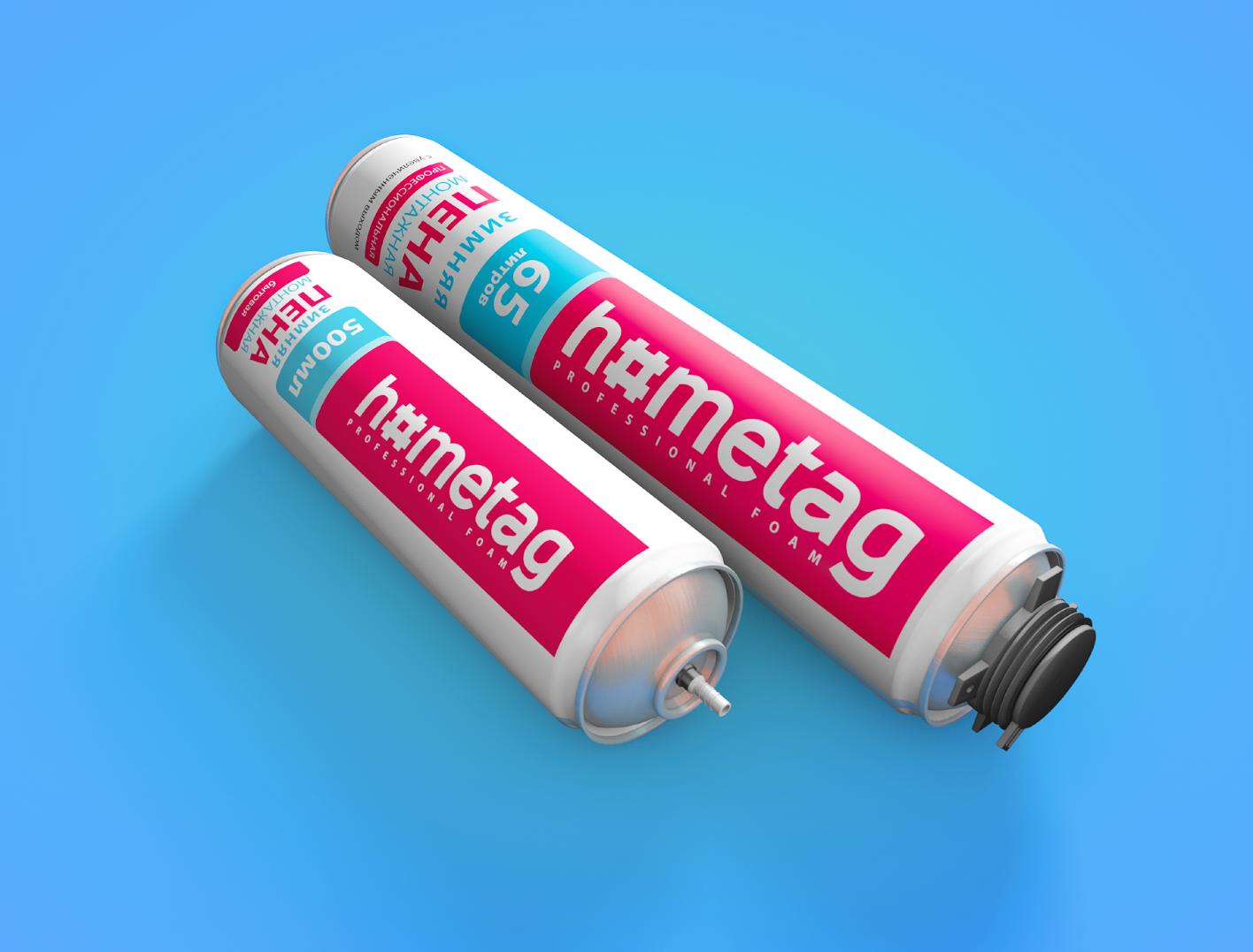
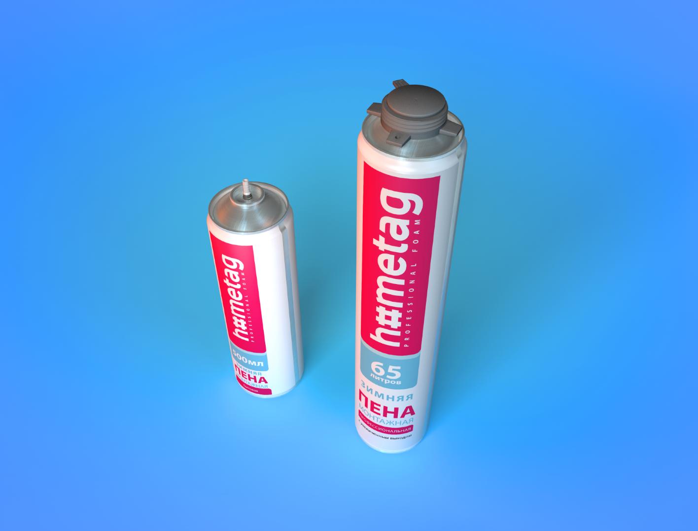
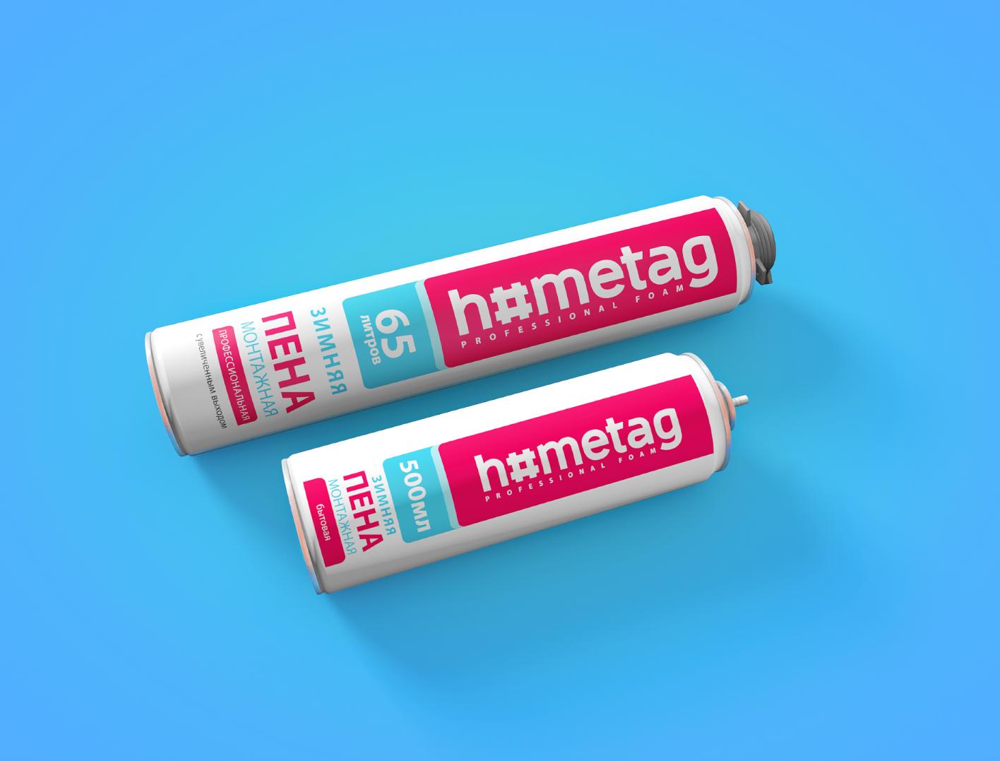
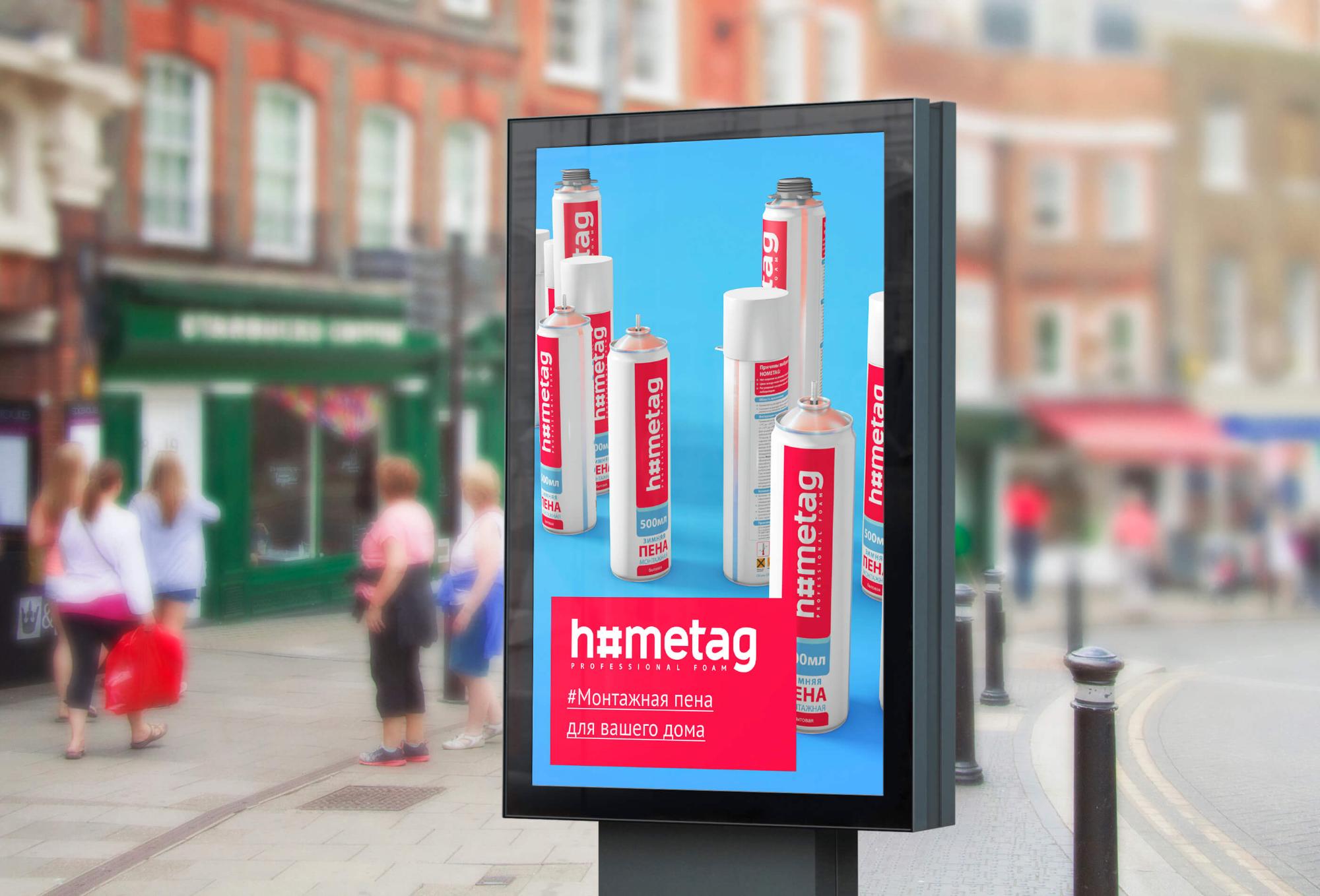

Naming, identity, packaging Hometag
The holding company "Domocenter" decided to offer the market a unique product: adhesives and polyurethane foam for repairs of high quality, but at an average competitive price. The agency was faced with the task of creating a name and visual design for such a useful product. In the repair, the main thing is not to forget about its ultimate goal. And the ultimate goal of any renovation is a home: cozy, beautiful and comfortable. And everything you need to create such a house is in a wide range of products offered by the customer. Therefore, we settled on the name Hometag. The association with the hashtag helps to showcase this broad perspective on renovation issues. In the corporate style, the hashtag theme is illustrated with a playful letter "O" stylized as the well-known "lattice". A fresh combination of white and pink colors was chosen for the product packaging. This hints that repairs are much easier and more enjoyable when you use reliable Hometag products. It also helps to stand out on store shelves. After all, manufacturers of goods for repair often bypass the pink color. And, in our opinion, in vain.
Client: HK
Category: Branding
Like
Similar projects
MacCoffee Dolce Vita
Branding
1

Trapeza "Around the World"
Branding

KOREA MOTORS branding
Branding

Kusai.me - branding
Branding
1

Naming, identity, packaging Hometag
Branding

kruchenas.net for the funniest milkman in the country
Branding

Water from the very heart of Siberia
Branding

Kruche! for AquaLand
Branding

kruchenas.net designed a logo for the training club
Branding
Krym cherez "Y"
Branding

Packaging design "Trapeza Na Vtoroye"
Branding

Delicious naming from kruchenas.net
Branding

Private label redesign Family Life
Branding

POS materials design for Amway
Branding

Grün branding
Branding
1

Forma branding
Branding

Naming and packaging Kraftig
Branding

Naming and identity "From My Hart"
Branding

Redesign of premium spices "Around the world"
Branding

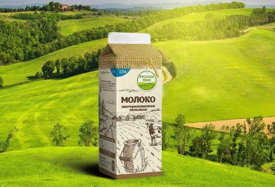
Russkoe Pole - branding
Branding
2
3D modeling of packaging
Branding

Dried apricots Sofa. Menu design
Branding

Felitta pasta
Branding

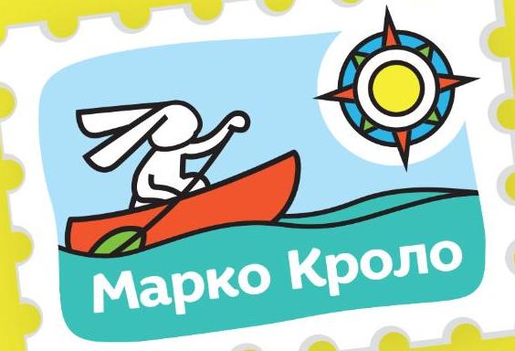
Naming and identity of Marco Crolo
Branding
«Trapeza Na Vtoroye». New portion
Branding

Packaging design "Recipes of Taste"
Branding

«Trapeza na vtoroye» for a multicooker
Branding