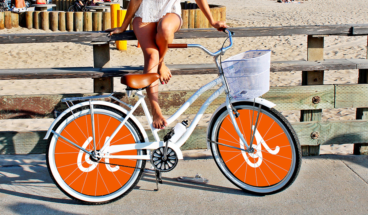


Krym cherez "Y"
Crimea is a place that evokes a storm of emotions. Here comes a newly arrived vacationer to the shore. Feels how the oncoming warm wave licks his still pale legs. And immediately breaks into a smile, stretching out with pleasure: "Kry-s-s-s-s-s". Or he walks out of the colorful funicular of the cable car straight to the top of the jagged Ai-Petri, looks around the unforgettable view that has opened up and shouts with delight: "Kry-s-s-s-s-s!". And in the evening on the balcony of his hotel overlooking the sea, our vacationer sips a sip of aromatic Crimean wine and nods approvingly: "Kry-y-y-y-ym." We decided to take the most emotional letter of the Russian alphabet, the letter "Y", as the basis for the new Crimean brand. This is the only vowel in the name of the peninsula, which reflects the whole storm of positive experiences that can give rest in this amazing land. In addition, this letter can become a worthy unique symbol of the Russian resort. After all, "Y" is a visiting card of the Russian language, a similar letter is found only in very few other dialects and can be considered a national treasure. A laconic sign with "Y" at the head can be replicated endlessly. With its help, you can present Crimea as the most friendly and positive resort on souvenirs, signs, signs, brochures, and promotional materials. At least, we are sure that anyone who sees this sign, after a second of confusion, will spread into a smile and cheerfully stretch out "Yyyyyyy!"
Category: Branding
Like
Similar projects
MacCoffee Dolce Vita
Branding
1

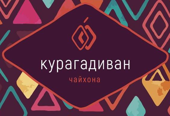
Trapeza "Around the World"
Branding

KOREA MOTORS branding
Branding

Kusai.me - branding
Branding
1

Naming, identity, packaging Hometag
Branding

kruchenas.net for the funniest milkman in the country
Branding

Water from the very heart of Siberia
Branding

Kruche! for AquaLand
Branding

kruchenas.net designed a logo for the training club
Branding
Krym cherez "Y"
Branding

Packaging design "Trapeza Na Vtoroye"
Branding

Delicious naming from kruchenas.net
Branding

Private label redesign Family Life
Branding

POS materials design for Amway
Branding

Grün branding
Branding
1

Forma branding
Branding

Naming and packaging Kraftig
Branding

Naming and identity "From My Hart"
Branding

Redesign of premium spices "Around the world"
Branding

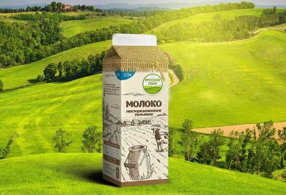
Russkoe Pole - branding
Branding
2
3D modeling of packaging
Branding

Dried apricots Sofa. Menu design
Branding
Felitta pasta
Branding

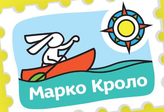
Naming and identity of Marco Crolo
Branding
«Trapeza Na Vtoroye». New portion
Branding

Packaging design "Recipes of Taste"
Branding

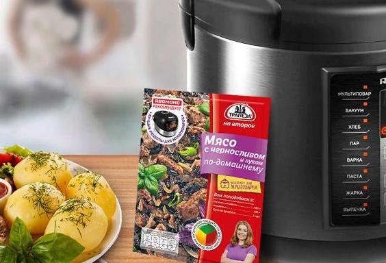
«Trapeza na vtoroye» for a multicooker
Branding