

kruchenas.net designed a logo for the training club
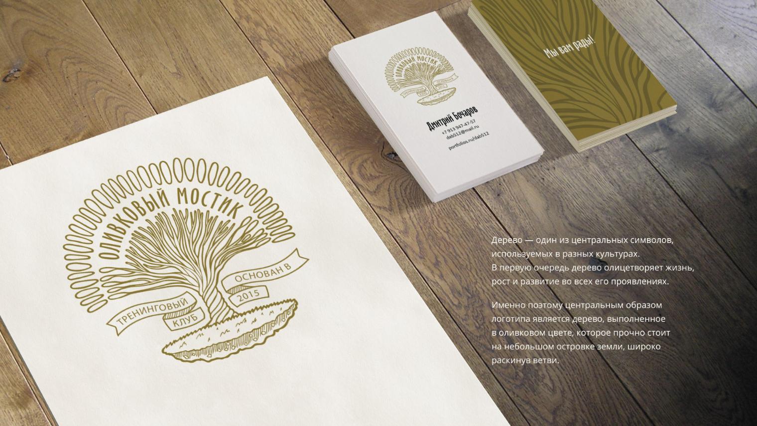
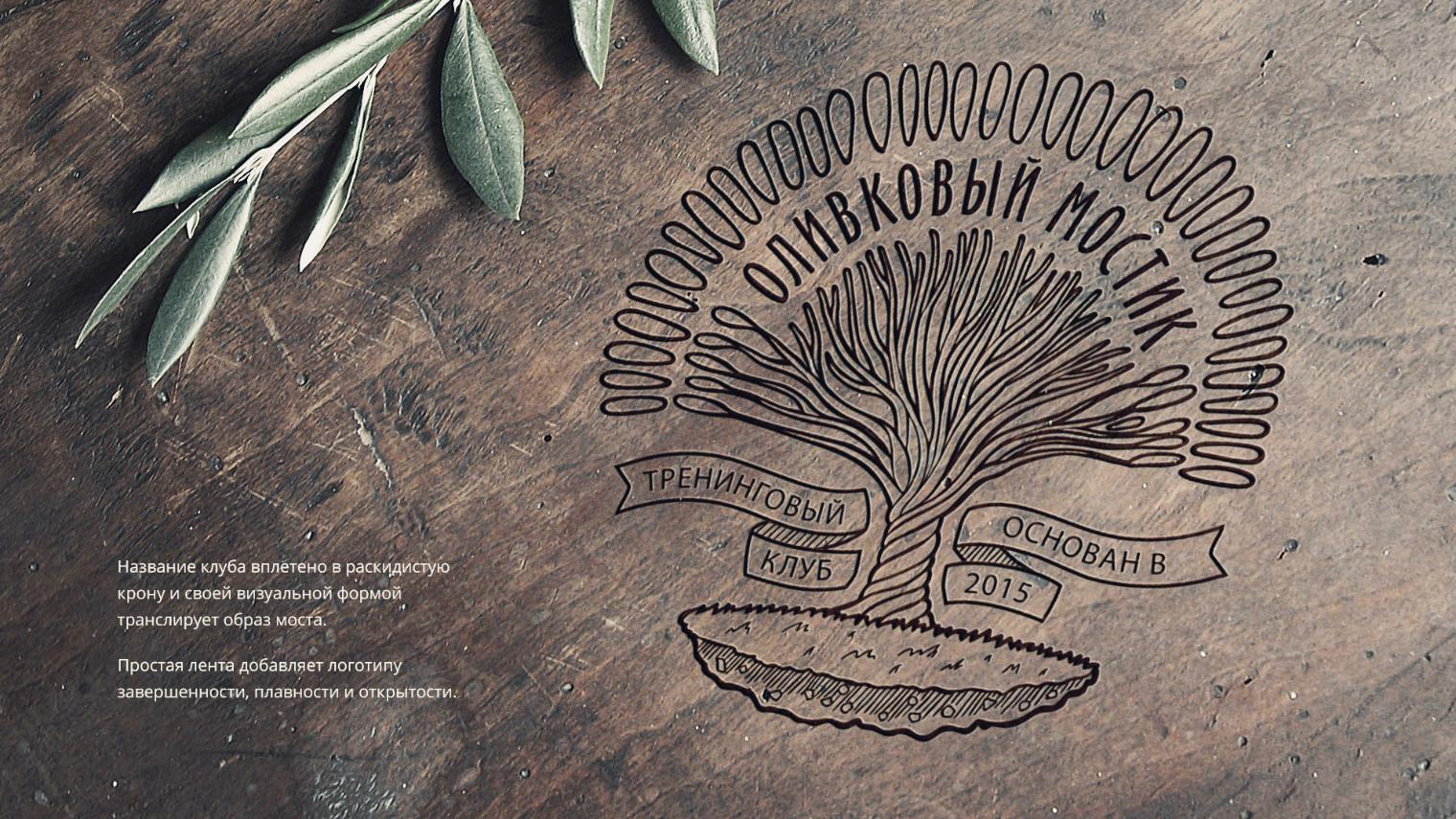
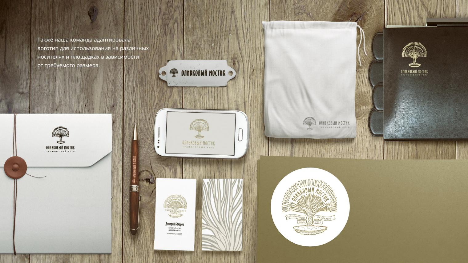
Olive Bridge is a training club founded in 2015 in Moscow. It is a place where people can change the better side, understand themselves, find ways to enjoy work, hobbies and everyday life. Before the team "Cool!" the task was to develop a logo that corresponds to the values and guidelines of the training club, so the idea of self-development, mental and personal growth has become key. The tree is one of the central symbols used in different cultures. First of all, the tree personifies life, growth and development in all its manifestations. That is why the central image of the logo is a tree made in olive color, which stands firmly on a small island of land and spreads its branches widely. The name of the club is woven into the spreading crown and, with its visual form, conveys the image of the bridge. A simple ribbon adds completeness, fluidity and openness to the logo. Also, our team has adapted the logo for use on various media and sites, depending on the required size.
Category: Branding
Like
Similar projects
MacCoffee Dolce Vita
Branding
1

Trapeza "Around the World"
Branding

KOREA MOTORS branding
Branding

Kusai.me - branding
Branding
1

Naming, identity, packaging Hometag
Branding

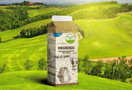
kruchenas.net for the funniest milkman in the country
Branding

Water from the very heart of Siberia
Branding

Kruche! for AquaLand
Branding

kruchenas.net designed a logo for the training club
Branding

Krym cherez "Y"
Branding

Packaging design "Trapeza Na Vtoroye"
Branding

Delicious naming from kruchenas.net
Branding

Private label redesign Family Life
Branding

POS materials design for Amway
Branding

Grün branding
Branding
1

Forma branding
Branding

Naming and packaging Kraftig
Branding

Naming and identity "From My Hart"
Branding

Redesign of premium spices "Around the world"
Branding

Russkoe Pole - branding
Branding
2
3D modeling of packaging
Branding

Dried apricots Sofa. Menu design
Branding

Felitta pasta
Branding

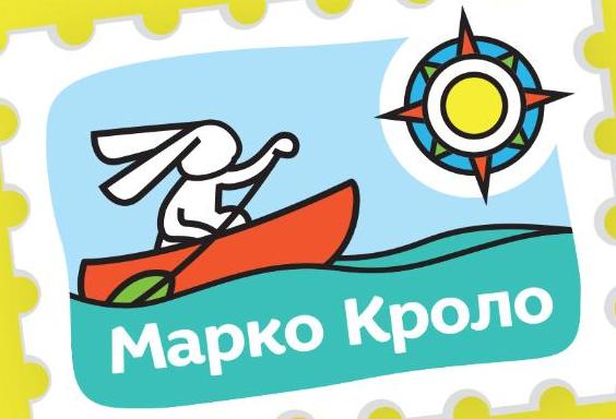
Naming and identity of Marco Crolo
Branding
«Trapeza Na Vtoroye». New portion
Branding

Packaging design "Recipes of Taste"
Branding

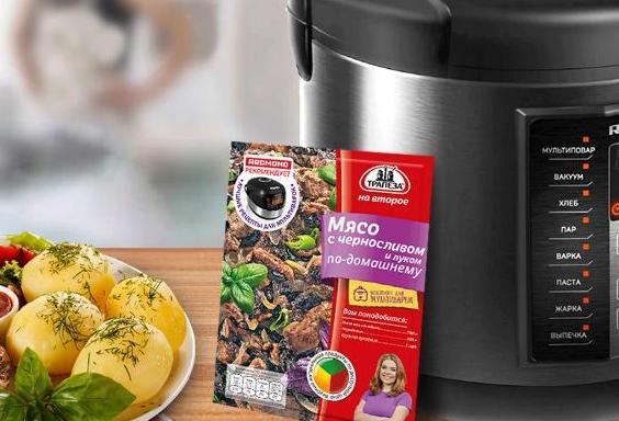
«Trapeza na vtoroye» for a multicooker
Branding