
POS materials design for Amway
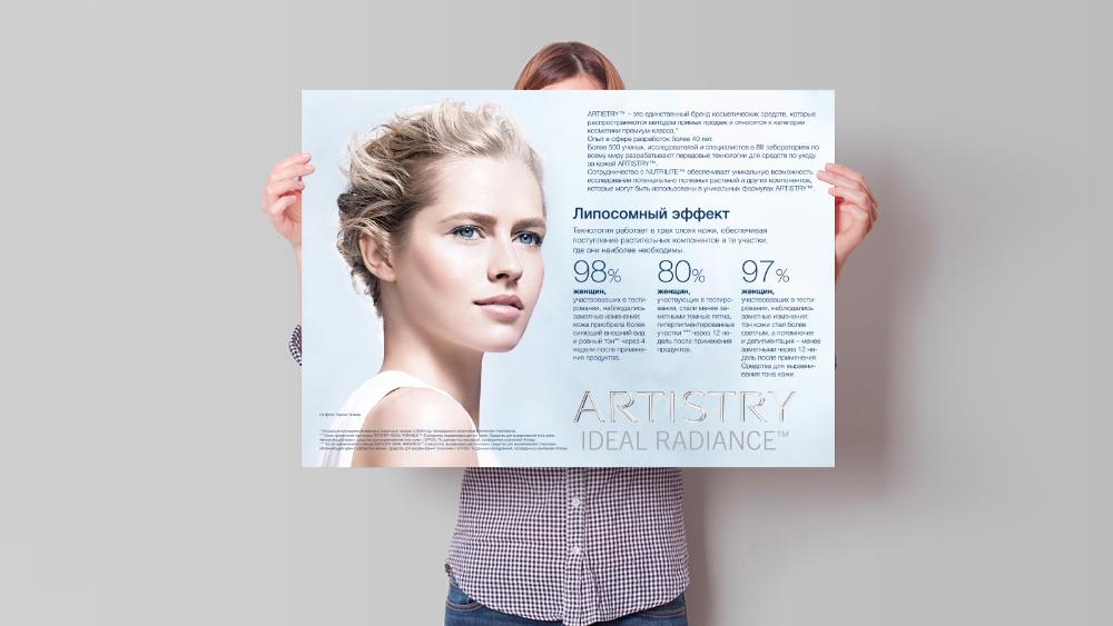
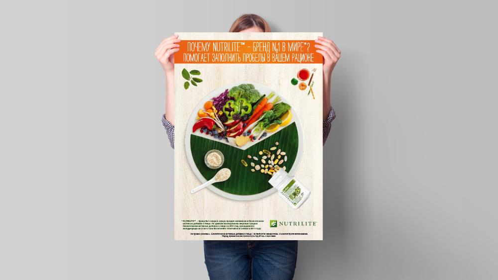
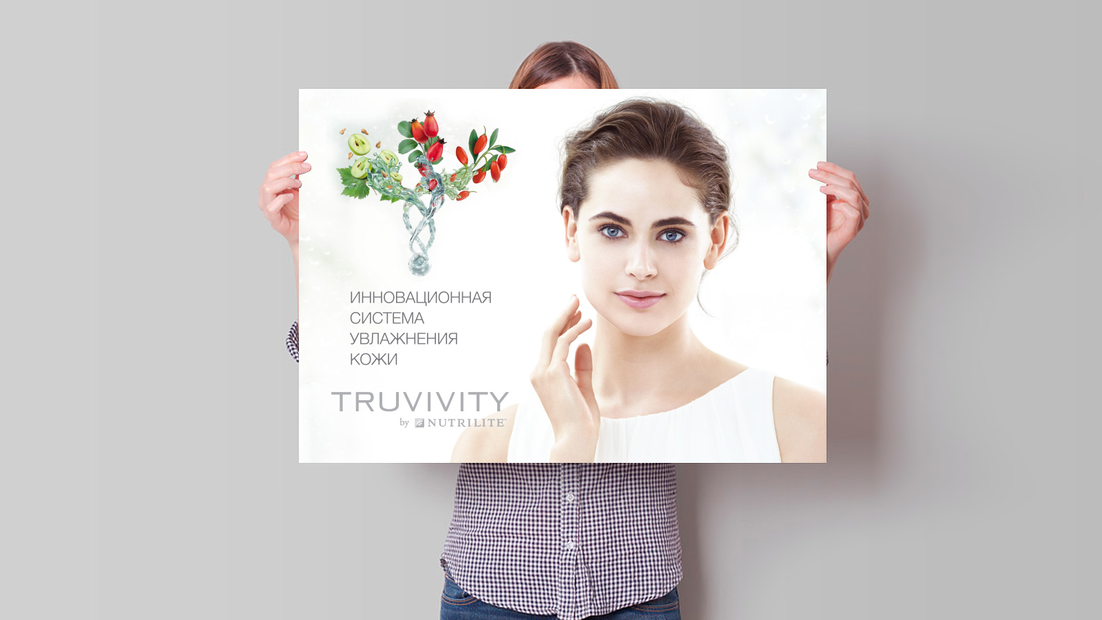
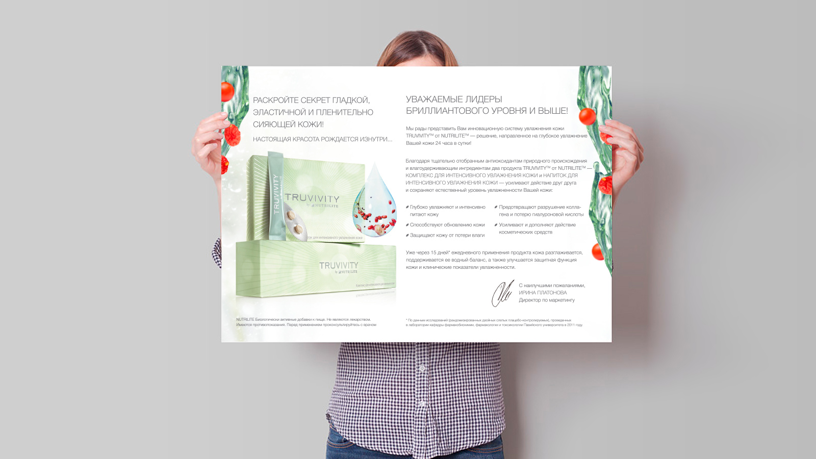
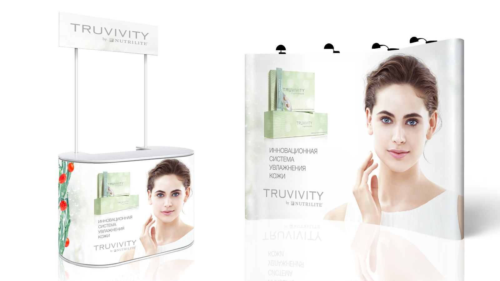
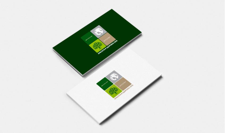
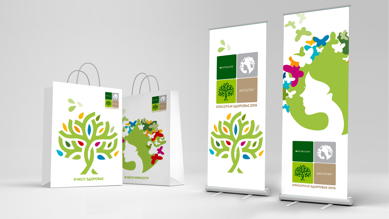
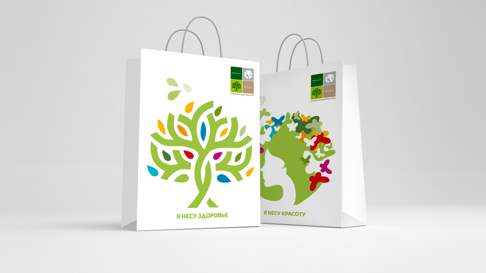
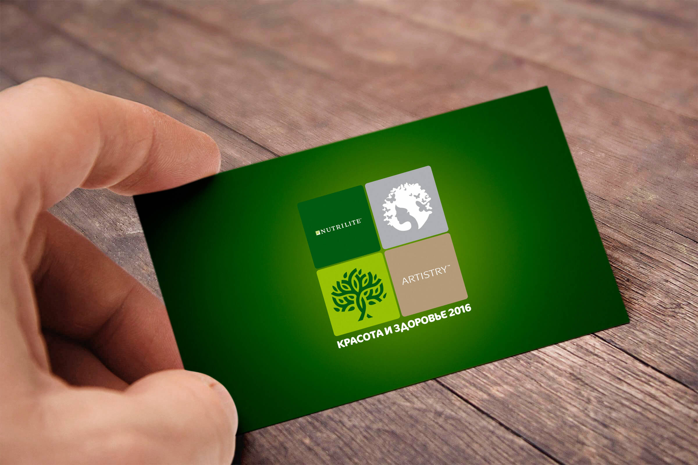
Amway is a company with many years of experience. She takes care of inner and outer beauty, thereby helping people to live better. The Amway conference "Beauty and Health 2016" is aimed at people who lead an active lifestyle, take care of their health and take care of their loved ones. It was these people that our designers were guided by when creating a corporate identity and logo for the conference. The thematic conference is dedicated to two major brands of Amway: Nutrilite (vitamins, dietary supplements and food) and Artistry (decorative cosmetics and skin care products). Therefore, the logo consists of two main elements with the product logos. The Nutrilite brand is visualized as a tree - a symbol of the natural beginning, life and its origins. The Artistry brand is presented in the image of a “blooming” girl, personifying natural beauty. Natural saturated colors and plant elements in the conference identity demonstrate sustainability and life potential. To fully immerse the participants in the atmosphere of the conference, information cards, branded bags, notebooks and various promotional materials were specially developed based on the corporate identity.
Client: Amway
Category: Branding
Like
Similar projects
MacCoffee Dolce Vita
Branding
1

Trapeza "Around the World"
Branding

KOREA MOTORS branding
Branding

Kusai.me - branding
Branding
1

Naming, identity, packaging Hometag
Branding

kruchenas.net for the funniest milkman in the country
Branding

Water from the very heart of Siberia
Branding

Kruche! for AquaLand
Branding

kruchenas.net designed a logo for the training club
Branding
Krym cherez "Y"
Branding

Packaging design "Trapeza Na Vtoroye"
Branding

Delicious naming from kruchenas.net
Branding

Private label redesign Family Life
Branding

POS materials design for Amway
Branding

Grün branding
Branding
1

Forma branding
Branding

Naming and packaging Kraftig
Branding

Naming and identity "From My Hart"
Branding

Redesign of premium spices "Around the world"
Branding

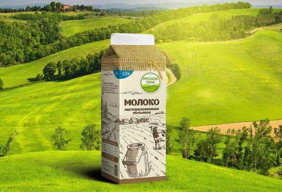
Russkoe Pole - branding
Branding
2
3D modeling of packaging
Branding

Dried apricots Sofa. Menu design
Branding
Felitta pasta
Branding

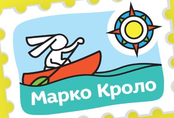
Naming and identity of Marco Crolo
Branding
«Trapeza Na Vtoroye». New portion
Branding

Packaging design "Recipes of Taste"
Branding

«Trapeza na vtoroye» for a multicooker
Branding